
3 DIY web design hacks for increasing sales
Web design is more than just colors and logos, it’s about making sure your visitors have what they need, when they need it. It’s about offering clear pathways to conversion, instilling confidence, encouraging visitors to take that final step to becoming customers.
Here we’ll show you three simple ways to improve the journey from visitor to customer, with no major design or user experience skills needed. Just a willingness to roll your sleeves up and have a go.
Before you start
If you’re not getting the sales you want, you may first want to check your analytics to see if it’s your conversions or your overall site/page visits that could be improved. If it’s the latter, you should look beyond conversion hacks and at the bigger picture. Consider things like improving your SEO or reaching out to customers through email marketing, social media, or even through more old-school PR coverage for your business.
If you really think it’s your site that’s letting you down, then here are some quick wins and tactics to try.
1) Clear away the clutter
The compulsion to want to tell your customers as much as possible about your business and products will always be strong. The more the better, right? Well…not quite.
Website visitors can easily be overwhelmed and put off by the amount of copy and other visual elements they see when they land. The content might feel like solid gold to you, but it won’t get read or understood because the visitors won’t hang around to read it.
No one wants to be pulled in too many directions by a website. visitors want things to be clear, simple, and easy to navigate. So, make sure you’re landing pages only offer exactly what visitors need:
- Headline and subheadings – keep these short and clear and use subheadings to break the page up into bite-size chunks.
- Benefits over features – always lead with benefits: simply tell the visitors how you make things better or easier for them first.
- Imagery/visuals – make sure these work alongside your content to add context: everything must have a function.
- Testimonials/reviews – back your statements up with short quotes from existing customers… more on this later.
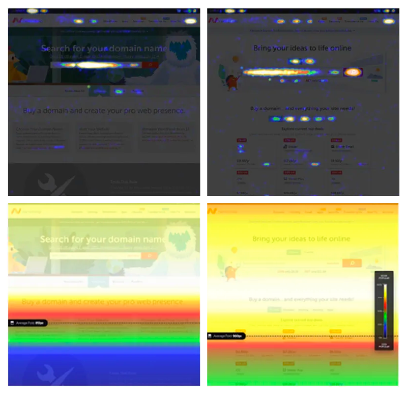
How can you tell what’s really clutter?
Take a look at your website through the eyes of your customers by using heat mapping. It shows you where your customers are looking and interacting with your website. More importantly, it’s showing you where they aren’t looking.
If visitors aren’t interacting with something, you can usually cut it from your website. The pages get simpler and conversion rates get higher. Take a look at some of the free trials from providers like Crazy Egg or Mouseflow amongst others in the market.
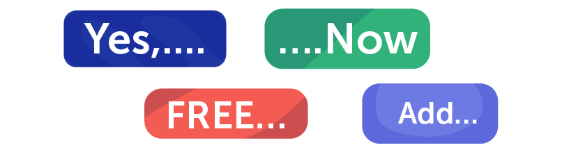
2) Sharpen your CTAs
Calls to action (CTAs) might be one of the simplest website components, but they also have one of the most important jobs. Done well they are the final push that gets visitors over the conversion finish line. Done badly they are a hurdle or even a barrier that stops conversions in their tracks.
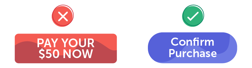
- Grab the eye – make sure your CTAs stand out and don’t get lost: buttons never go out of style, and subtlety is not your friend.

- Be crystal clear – don’t try and be too playful or clever with your CTA: give clear instructions to your visitors.

- Make it easy – keep your CTSs looking effortless and enticing do people don’t have second thoughts.
- Adjust for different pages – adapt your CTA buttons for different website locations, because one size doesn’t fit all.

- Get psychological – try a few best practice words that tend to increase conversions across CTAs, but feel free to adapt to your needs and brand.
You can also take a look at your website’s analytics to check which pages are bringing the most visitors. Make sure you have strategically placed CTAs there, where they’re most needed.
Most of all test, test, and test again to see what’s working.
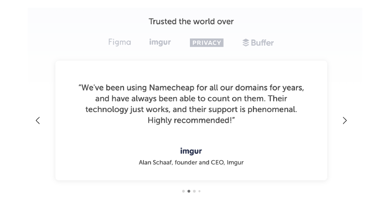
3) Let your customers do the talking
It stands to reason that you’ll want to talk about how great your business is, but there is often no greater advocate for your company than its customers. Their seal of approval is essentially ‘social proof’ that you’re as good as you say you are, so use it to your advantage — right from the homepage or important landing pages.
Testimonials and quotes
Many websites have a ‘Testimonials’ page, and even full case studies, but adding short quotes from happy customers on your homepage and on other key pages can really help validate your business and drive sales. They don’t need to be epically long. It just takes a quick email or phone call.
Try and include as much customer detail as possible. Quotes and testimonials work best when they are from important or senior figures — especially in the B2B world
Company logos
Using client or partner logos gives your website an even more professional shine. They are a great way to show you work with credible people. Even if the logos aren’t instantly recognizable: a modern looking logo equals a professional logo in most people’s minds. The more recognizable the better, though.
Remember to check it’s ok to use the logos with your clients, however, otherwise you may be infringing copyright law.
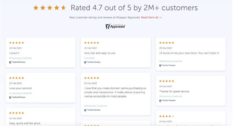
Customer review platforms
If you have the volume of customers, and the budget, you could use customer review platforms such as Trustpilot or Shopper Approved which comes with a free trial. This is essentially adding validation on top of validation: showing new customers fully verified reviews. You can then update your website with the best — although make sure you’re ready to commit to making regular updates.
If you’ve got a few more tech-savvy skills, you can also link to a live page that filters and shows the reviews.
Every market and customer base has its differences, and so the ability to adapt and test is most important when looking for long-term customer growth. But de-cluttering, creating better CTAs, and showing social proof are universally recognized ways to increase sales. If you’d like to dive a bit deeper, then check out 10 website design tips for a stunning and usable website to take your knowledge to the next level.


![Hero image of [NEWS] Tech community rallies around Ukraine3 DIY web design hacks for increasing sales](https://www.namecheap.com/blog/wp-content/uploads/2022/03/News-11-March-Header.png)