UX design hacks that are holding your website back
Every one of the following UX tactics worked at some point, which is exactly why your site may still use at least two of them. Popups genuinely grew email lists. Countdown timers genuinely lifted sales. Carousels genuinely let three departments share one homepage without a meeting.
But over time, each became less effective, and many of those turning points are well documented. What follows is a look at five once-popular tactics, when they stopped delivering, and what the data suggests using instead.
The popup that greets visitors before your website does
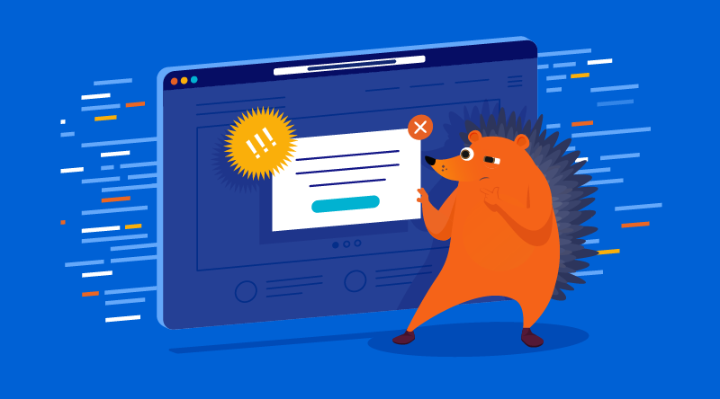
The email-capture popup is the classic asymmetric bet gone wrong. Vendor benchmarks still show popups converting around 4 to 5% of visitors, which sounds like a win until you count who pays for it: the other 95%, every one of whom experiences the interruption. When Nielsen Norman Group had users rate 23 ad formats, modal popups ranked as the most hated format on desktop and mobile alike, with participants volunteering lines like “ads that pop up just make me hate the product being advertised.”
The dateable ending: January 2017, when Google’s intrusive interstitial penalty went live, making aggressive popups a search-ranking liability on top of an annoyance. If you keep one, keep it polite: triggered by scroll depth or exit, easy to dismiss, never in the first ten seconds.
The urgency theater
Countdown timers, “only 2 left!” badges, “17 people are viewing this.” Princeton researchers who crawled 11,000 shopping sites found fake urgency was the single most common dark pattern family on the web, complete with third-party vendors selling it as a service.
Two things ended this trick. First, the evidence that it doesn’t even convert: a controlled study found discounts with countdown timers produced no stronger effect than the same discounts without them, while some participants avoided the product because the timer looked, in their words, sketchy. Second, the regulators arrived, and not just for Big Tech. The FTC’s $2.5 billion Amazon settlement over its Prime enrollment flow made 2025 the year dark patterns got a price tag, and the UK’s competition authority opened its first consumer-law enforcement wave against, among others, a gym chain, two driving schools, and furniture retailers over misleading time-limited offers. Gyms and driving schools. This is now a small-business compliance issue, with UK fines running up to 10% of turnover.
Real deadlines are fine. Say them plainly. If the offer doesn’t actually end, your credibility shouldn’t either.
The homepage carousel
The carousel survives because it solves an internal problem (five stakeholders, one hero slot) while failing the external one. The University of Notre Dame’s famous measurement found that about 1% of visitors clicked the carousel, and 84% of those clicks went to the first slide. Slides two through five are where messages go to be technically present. NN/g’s testing added the memorable detail of a user who couldn’t find a deal advertised in a rotating banner because it kept moving: “It keeps flashing too quickly.”
That evidence is from 2013. The trick has been dead for over a decade and remains installed on half the small-business web, which makes it less a design choice than an inheritance. Replace it with one static message, chosen by whoever is bravest, and watch nothing bad happen.
The navigation that plays hide and seek
The hamburger menu earned its place on phones. Then it migrated to desktop, hiding your site’s structure behind a tap nobody owes you. NN/g’s quantitative study found hidden navigation made content discoverability drop by more than 20%, and desktop users at least 39% slower to complete tasks.
Your services menu is not clutter. It’s the pitch. Related offenders in the hiding-things family: scroll-hijacking, which NN/g politely dismantles in Scrolljacking 101, and B2B sites that hide pricing entirely, a habit aging badly now that Gartner finds 67% of B2B buyers prefer a rep-free experience. Buyers who can’t find a price don’t call. They leave.
The chat widget pretending to be Brenda
Chatbots can be tempting because they work: a Marketing Science field study found that undisclosed chatbots sold as effectively as skilled human agents, while disclosing the bot upfront reduced purchases by nearly 80%.
That temptation is exactly why California made undisclosed commercial bots unlawful back in 2019, and why the honest version wins long-term. A bot labeled as a bot that instantly answers your five most common questions is useful. A bot named Brenda with a stock-photo face is a trust grenade with a delay fuse.
What this list has in common
Each trick borrows against trust to hit a nearer-term number, and each was copied from bigger sites without the thing that made it survivable there: a testing team measuring the damage. The Princeton crawl found the most popular sites use the most dark patterns, which is precisely why they look like best practice from the outside. Amazon can afford a trust tax. A twelve-page site for a plumbing firm cannot.
Meanwhile, the boring fundamentals compound quietly in the other direction. The Google/Deloitte “Milliseconds Make Millions” study measured a 0.1-second mobile speed improvement lifting retail conversions 8.4% and lead-gen forms 21.6%.
Accessibility also offers a clear competitive advantage: WebAIM Million 2026 found detectable accessibility failures on 95.9% of the top one million homepages, with low-contrast text — the web’s most fixable problem — appearing on 83.9% of them. Pass where 96% fail, and you are, by definition, differentiated.
If you only do one thing after reading this, run your homepage past one person who’s never seen it and ask what your business does and what they should click. The tricks on this list all exist to avoid answering those two questions. The elements of a good website haven’t changed: clarity, speed, and text people can actually read. What changed in 2026 is that the shortcuts around them now cost rankings, trust, and occasionally a settlement.
Your instincts aren’t wrong, just trained on 2016 data. Update them the way you’d update anything else on your site.