
How To Make a Killer Home Page That Converts
First impressions matter. For many, your website’s home page will be their first impression of your brand. You need to make sure it’s a good one. The effectiveness of your home page can mean the difference between a user staying and browsing or leaving, never to return.
But how can you get it right?
Like with any web page, getting it right will require trial and error, and testing what works and what doesn’t consistently. But by bearing the following points in mind, you’ll create a home page optimized for maximizing organic traffic, as well as conversions.
Read on to find out how to produce a strong, engaging home page that makes people want to stick around.
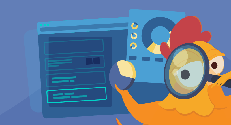
1. Make It All About the User
Whether you want to sell a product or service, or you want people to subscribe to your blog, the success of a website begins and ends with users. As such, your home page needs to effectively communicate what you’re about. More than that, it needs to communicate how what you’re about can benefit them.
Bragging about how great you or your company is isn’t helpful. In the end, we’re all selfish creatures. We don’t care about how great your company is. We want to know what’s in it for us. Think about the following:
- What problem is your user trying to solve? How did they find your page? If it was through organic search, what keywords brought them there? This should inform your home page content.
- Check out your competitors’ home pages. How are they designed? What kinds of offers are given priority? How can you set your offering apart?
- What is your unique selling proposition (USP)? That is, what can your offering do for your user that nothing else can?
Upon reaching your home page, users should be able to immediately figure out what your offering is and how it can benefit them.
2. Tell Your Users What to Do
Your home page should have at least one call to action (CTA). A CTA can be a button or hyper-linked line of text that instructs your users to take an action. For example, “Buy now!” or “Get your free download”.
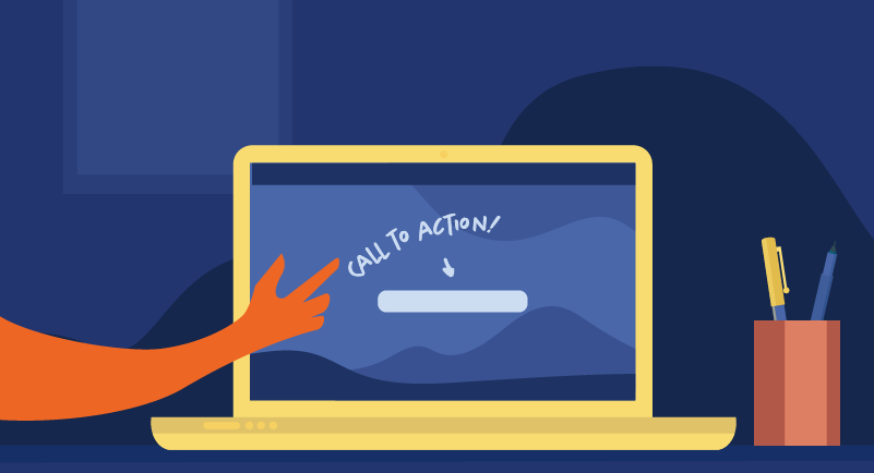
Clicking these commands will lead your user either to your e-commerce store or to the page where your free offering is located. It’s an easy way of taking users where they need to go without them having to even look at the navigation bar (which we’ll talk more about in a bit).
The kind of CTA you have on your page is dependent on your conversion goals. You could have one or several, catering to website visitors in different stages in your sales funnel. The stages of a standard sales funnel look like this:
- Awareness
- Interest
- Decision
- Action
Let’s break down each stage and talk about what kind of CTAs are suitable for each.
- Awareness: In the awareness stage, a lead has become aware of your business and what you’re offering, but is probably not yet ready to buy. This and the next stage are also known as the education stage. You don’t want to push them to buy anything, but provide informative content about your niche. This could be in the form of blog posts, a free e-book or white paper, or even a newsletter.
Try “Learn more!” or “Subscribe now”.
- Interest: The interest stage is essentially the research stage, where the website visitor is not ready to buy but comparing and contrasting their options. Much like the previous stage, your lead is looking to be informed.
Take educational content one step further by leading them to product comparisons or case studies. You could even invite them to browse the kinds of products that are popular with established customers. This is a clever way of encouraging visitors to explore your offering without it being forceful. Take the opportunity to position your offering as the best choice.
Try “See examples” or “Explore customer favorites”.
- Decision: At the decision stage, the lead is ready to buy. Content like user guides, or free demos or trial downloads could be just the thing to nudge them in the direction of making that purchase.
Try: “Get a free quote” or “Try for free!”.
- Action: As you may have guessed, the action stage is where the lead takes action and purchases a product or service from you.
Try “Buy now” or “Shop now”.
Chances are, visitors have landed on your site for a specific reason. Make it as easy as possible for them to take action by directing them with effective CTAs.
That said, be careful not to clutter your home page with competing CTAs, but rather one or two that stand out and are relevant to your conversion goals. Experiment with your CTAs, and conduct A/B testing to find out what works and what doesn’t.
3. Do SEO Keyword Research
Optimizing your home page isn’t just about conversions. You also want to make sure it’s getting found in search engines. This is where search engine optimization comes in. Conduct keyword research to find out what potential customers are likely to search for. From this, you’ll decide on a primary keyword and supporting keywords.
Include your primary keyword in:
- The H1 tag: There are various header tags on a webpage, but the H1 header is the most important. It is the first thing people will see on search engines, so it should communicate exactly what you’re offering. Read our piece on writing clickable headlines.
- Meta Description: The meta description is the description of your website that shows up on search engines. At a maximum of 150 characters, it provides another opportunity to describe exactly what your site is about. It’s also a good idea to include a CTA to encourage clickthrough and any offers or discounts you may have.
- Image file names and alt text: One-word image file names are a wasted SEO opportunity. Your naming conventions don’t necessarily need to be complicated, but it should be relevant to the page itself ideally include a target keyword (but only if it’s relevant). It should be short, but descriptive. The alt text (which is a description of what’s in the image) should also include an appropriate keyword.
Target keywords should also be placed naturally throughout your content and other header tags, like H2s and H3s. Don’t go overboard, as it needs to read naturally. Keyword stuffing in this day and age will inevitably backfire.
Find out more about finding the right SEO keywords and read our guide to performing SEO keyword research.
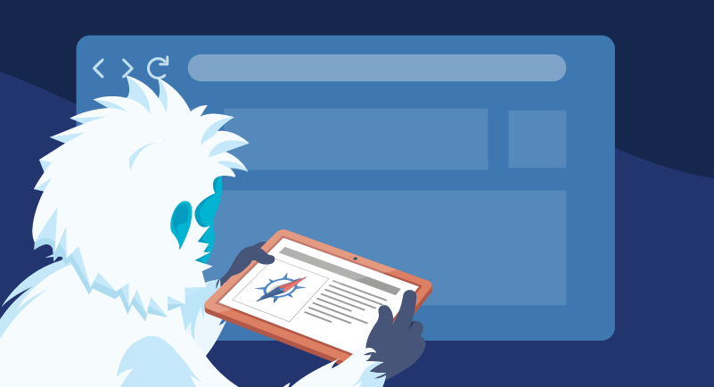
4. Don’t Overdo the Content
This applies to both written content and visuals. As we said before, the home page is essentially an introduction to your brand, so it’s natural that you’d want to make it as nice and appealing as possible.
It’s important to make a visitor feel welcome on the site and communicate what you or your business is about, but accept that you won’t be able to shoehorn everything in there. A giant wall of text isn’t very welcoming. Information should be concise, but still informative. It’s a hard balance to strike, but it’s possible!
This is where your SEO header tags come in handy. They make for a great way of breaking up your content into specific sections, which will also make your home page more scannable. Bullet points and short paragraphs will also help with this.
Similarly, don’t go overboard with flashy images and elaborate animations. This isn’t a user-friendly approach, particularly if you have mobile visitors. Your home page will be rendered slow to load, and many potential leads may leave before learning what you’re all about.

One image you should definitely feature on your home page (and every page on your site) is your brand logo. Studies show that placing it on the top left corner of a web page makes for optimal brand recall. It’s also best practice to have it linked to the home page.
With both copy and media, it’s best to keep things to a minimum. Choose what is relevant to your overarching USP.
5. Keep Navigation Simple
Your website navigation should be intuitive and easy to use. It should be very clear to a user how they can get from one page to another as soon as they hit your home page. Otherwise, they’ll bounce.
Ensure users will stay on your site with an easy-to-find navigation menu with descriptive labels. The most common navigation bar type across websites is a horizontal menu placed at the top of the page. This should link to the main pages on your site and also include a search box.
For e-commerce sites or websites with more pages, you could opt for a drop-down menu or hamburger menu.
For more information on establishing effective website navigation, check out our piece on website architecture.
6. Don’t Neglect the Footer
The footer is the bottom section of a webpage. For business websites it’s standard practice to include:
- Contact information: This can include the bricks-and-mortar company address, email address, and phone number.
- Legal stuff: Your legal company name, the copyright year, links to any disclaimers, a privacy policy, and terms of service
- Social media buttons and links
The footer is also an opportune place to include more navigation links. Like the navigation menu, your footer should be consistent across your site, that is, the same on every page.
7. Keep It Updated
Beyond ensuring the information on your website is correct and relevant, make your home page extra appealing and worth revisiting by updating it often with fresh content. This could be anything from special offers and new products or services to company updates and links to your newest blog posts.
Conclusion
When it comes to a great home page, simplicity is key. By keeping your content short, relevant, and actionable, doing SEO keyword research, and ensuring your navigation is user-friendly, your home page is certain to make a great first impression.
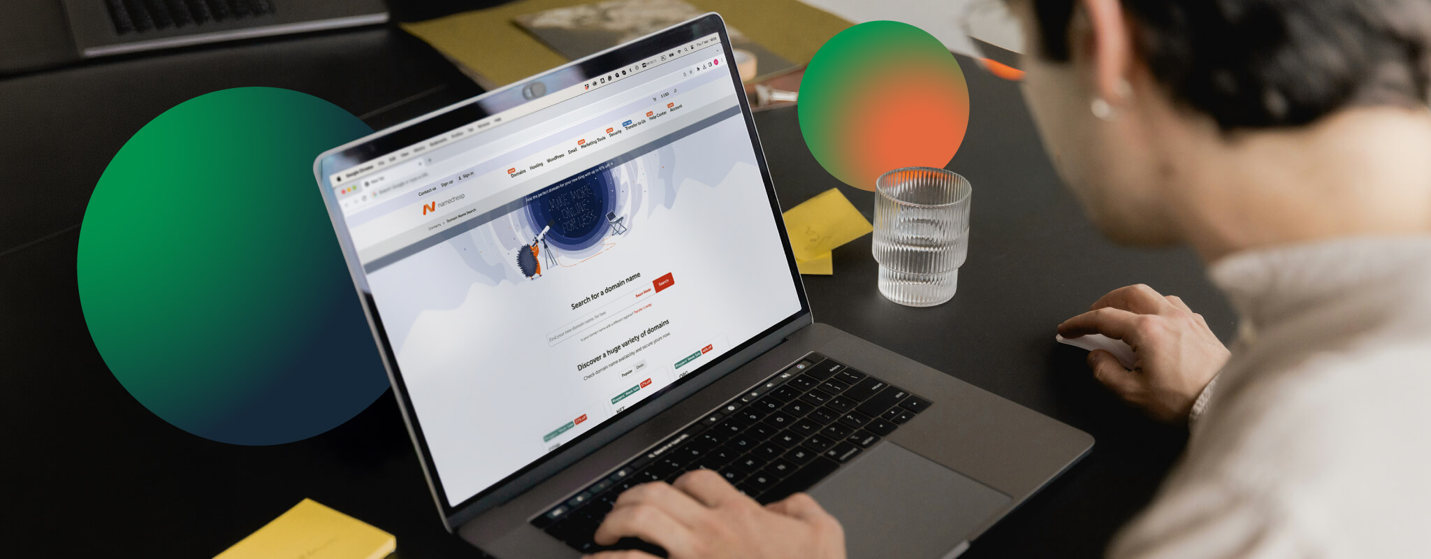
If you’re looking for a home for your new home page, check out EasyWP. It’s Namecheap’s own managed WordPress solution, and it will allow you to get your WordPress website up and running in a snap!


Thanks, was just looking for the ways how can I make an effective home page for making more sales