16 CSS units that every developer should know
Knowledge of Cascading Style Sheets (CSS) is an essential part of any web developer’s arsenal. CSS allows you to design and modify HTML code, including the code within WordPress themes.
When it comes to using CSS, there is a wide range of ‘properties’ such as margins, font-size, and so on. To modify those properties, you would use CSS units to create well-coded, cross-browser-compatible websites. These units can be used for everything from font sizing to positioning.
In this post, we’ll look at 16 distinct absolute, relative, and viewport units in CSS and how they operate.
Let’s dive in.
What are CSS units, and how do they work?
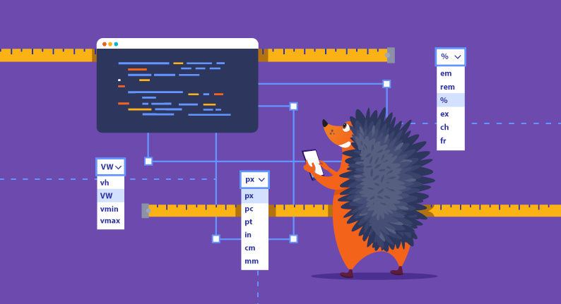
CSS units allow you to modify a website’s design, so it’s important to understand how they operate. There are three different types of CSS units:
- Absolute Units: px, pt, PC, in, cm, mm
- Relative Units: em, rem, %, ex, ch, fr
- Viewport Units: VW, vh, vmin, vmax
Let’s take a more in-depth look at each one.

Absolute units
Let’s begin with the most basic units. Absolute units should only be used in specific parts of website design or when printing.
The most common absolute units are:
- px
- pt
- pc
- in
- cm
- mm
1. Pixels (px)
A pixel is the smallest unit of measurement in digital design. Pixels are to digital design what inches are to traditional print design. A pixel can be defined as 1/96th of an inch.
This unit is designed specifically for CSS. Its value depends on the screen’s resolution, which affects the size of the pixels on the screen. For example, if you have two screens with different screen sizes, but both have the same resolution, then the pixels will look similar on both screens.
While the CSS pixel isn’t the same as a physical pixel, it’s close enough that we can use it for measurements.
2. Points (pt) and picas (pc)
Next, we have points and picas. These units are still used in print design but are slowly being replaced by pixels. Even though they aren’t currently very popular in the virtual and real world, they date back to the typeface and are mostly used with things like font size.
A point is 1/72nd of an inch, and pica is 1/6th of an inch.
3. Inches (in), centimeters (cm), and millimeters (mm)
These three units are similar and are used for measuring things in the real world. They’re most suited for styling your website to look good when it’s printed rather than when it’s viewed on a screen. They make certain that the components, layouts, spacing, and typefaces are spot on for every online application user.
However, the downside to these units is that different devices can have different screen sizes and densities, affecting how people see your website. For example, a website viewed on a mobile device will look different from the desktop version.
For this reason, you might want to use other relative units instead of absolute ones to ensure everyone has a good experience on your website.

Relative units
Now that we’ve covered absolute units, it’s time to tackle relative ones. Relative units make responsive design easier for the ever-increasing need for adaptable interfaces.
1. Percentage (%)
Let’s start with the most well-known relative unit, the percentage. Anything that is represented in CSS with this unit is relative to:
- The parent (the containing element that encloses ‘child’ elements) that is connected to
- When a child element has a position set to absolute, the last parental element with relative positioning will determine its position.
- The root element (top level element from which all other elements descend) when the position is set to “fixed.”
There are a few things to watch out for when setting the width or height of an element to a percentage value. For example, if you set the width or height to “auto” or don’t set it at all, it might not work correctly. But when everything is set up correctly, percentages work great for setting the dimensions of large containers, elements that are high in the DOM hierarchy, or elements that take up the whole page.
2. Ex/Ch
Next, we have ex and ch, specific units that are only useful when dealing with monospaced fonts.
Ex is relative to the height of the letter x in the current font. Ch is relative to the width of the letter 0 in the current font. So both are measurements of a character’s size, either on the x or y-axis. And yes, these measurements are affected by the font size of an element.
You’ll need to adjust fonts for headings and symbols manually, so they’re easy to spot, read, and recognize. Because standard typefaces have characters of varying heights and widths, you’ll either have to have a very specialized use case for these units or use a monospaced font and design your documents with it (e.g., an online code editor or something).
While the ex and other relative units are supported on most devices, ch is not as good, although it still works almost 98% of the time.
3. Fr
Fr is a new CSS unit representing a fraction of a container’s free space. It is relative to how much space is left over after other elements have been placed.
This can be useful for creating responsive interfaces because it allows you to allocate space for different elements based on the available space. The fr unit is supported by all major browsers, so feel free to use it in your projects.
4. Em/Rem
Finally, here are two units favored by most developers — em and rem. If you’ve ever created a modern, well-developed website, you’re undoubtedly familiar with them.
Em is a unit of measurement equal to the element’s font size. So if you have a font size of 17px, then 1em would be 17px. This way, when you design things, they will look the same on different devices and browsers.
However, dealing with ems may be challenging. That’s because the font size is passed along to child elements whenever it’s set, so you may quickly lose sight of what the font size is equal to (especially when you set the font size using ems, which makes it relative to the font size of the parent). That’s where rems come in.
Only the root element may affect rem in CSS. It’s similar to rem in that it’s limited to font size, but it is relative to the font size of the root element. It also implies that with one single property, you may manage the sizing of your website. Rem has less helpful support than em, but it is the most popular relative unit in CSS among developers and a preferred alternative to em.

Viewport units
Lastly, we’ve got the viewport units. These units are fairly easy to understand and offer some great new functionalities that were not possible before.
The “v” in each of them stands for “viewport” because that is the main part of their relativity. After that, it states what part of the viewport the unit is relative to, including height, weight, minimum, and maximum.
When working with fixed-positioned components like pop-ups, these viewport units are quite useful because they make the component resize itself according to how big or small the viewport is.
Design with confidence
CSS units can be a little confusing at first, but with a basic understanding of how they operate, you can create websites that look great on any device.
We’ve covered the essential CSS units that every developer should know and provided examples of how to use them in your projects, so don’t be afraid to experiment and see what works best for you. With a little practice, you’ll be using these units like a pro in no time!
If you’re still having some trouble and need some extra assistance, check out Namecheap Site Maker, where we’ll help you build your dream site with little to no experience!